Oyna
Oyna is a news app focused on everything gaming related.
case study
Overview
This was the third student project i designed. For this exercise we were free to choose the kind of app we wanted to design and i choose to build a news app for anything gaming related. This taks focussed on the differences between Android and IOS. I created two versions of the same app, following the appropriate guidelines for each platform.
Requirements
The deliverables for this project were broken down into the following tasks:
- Project Proposal
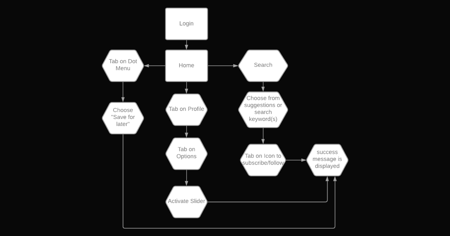
- User Stories and User Flows
- User Flow Diagram
- IOS and Android Wireframes
- Creating an interactive Prototype
- User Testing
- IOS and Android User Interface Design


Proposal
The first task in the project required us to develop a proposal defining what our app would be used for, its objectives, position in the market, how it would be different compared to similar apps and what user we were expecting to use the app. Below are some of the key points from my proposal for Oyna.
App Name: OYNA
Keeping up with all gaming related content on multiple Websites and Apps can be tiresome nowadays. A place where every gaming related topic, be it hardware or e-sports, is covered, could be beneficial to users, who are interested in a variety of gaming related news and articles and seek a quick overview.
Context:
Since I have been a gamer all of my life and also worked in the industry, Gaming and mostly everything relegated to it, is still one of my favourite hobbies. I keep up with with news on different websites and apps on a daily basis, which takes a significant amount of time. My app would serve as a place where the user can easily search and find any news, he is interested in and save his preferences for later so he doesn’t have to browse for long.
Target Users:
Anyone who is interested in gaming and wants to have all information quick and and handy in one place
Competitors:
Joystick, reddit
Key Features:
-Search for any video game related content
-api powered
-user profile to save news
-newsstand (for content which can not grabbed by the api or premium/paid content from other sources
User Stories & Flows
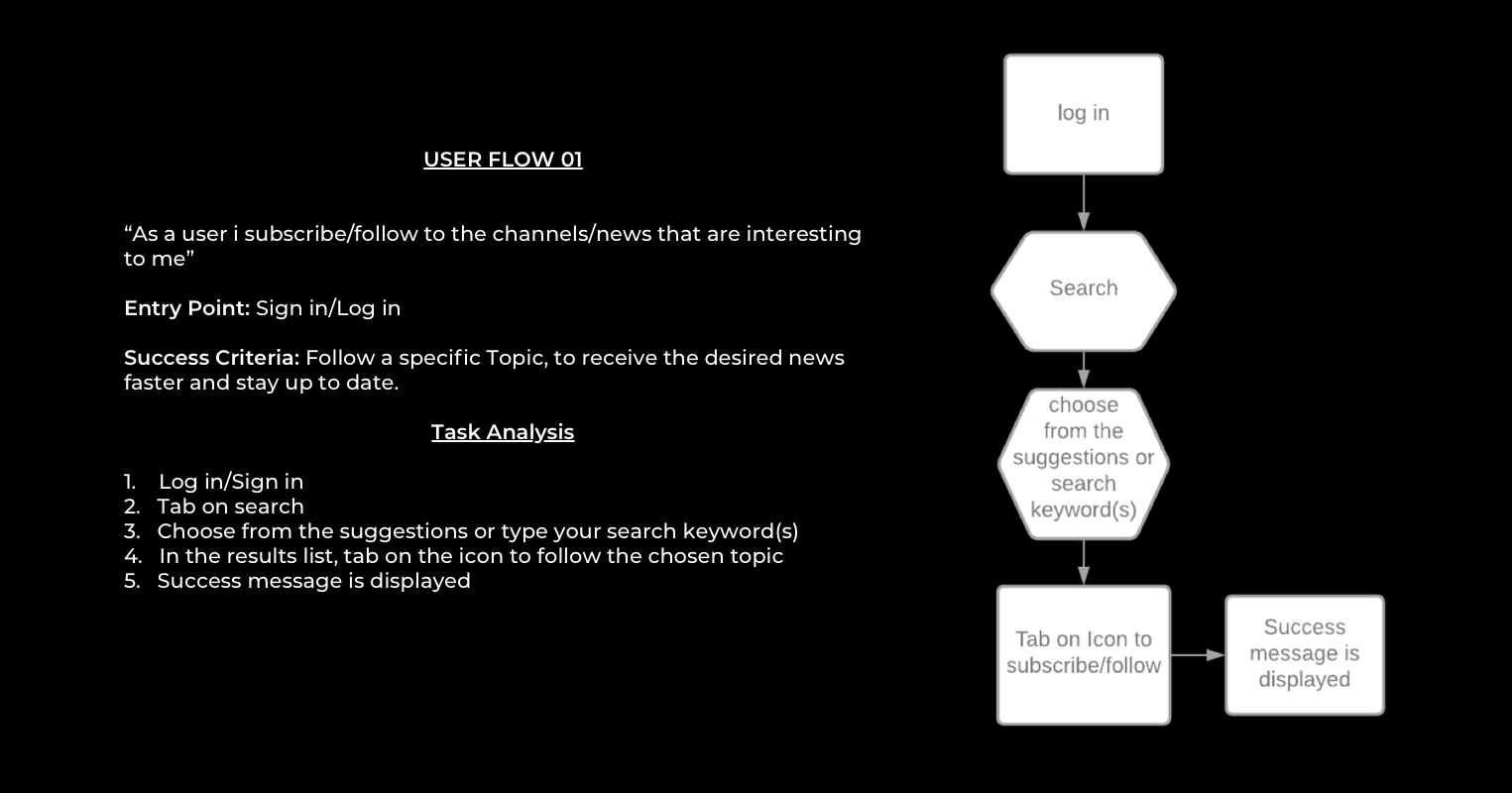
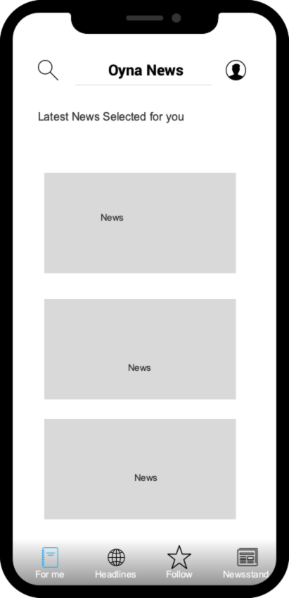
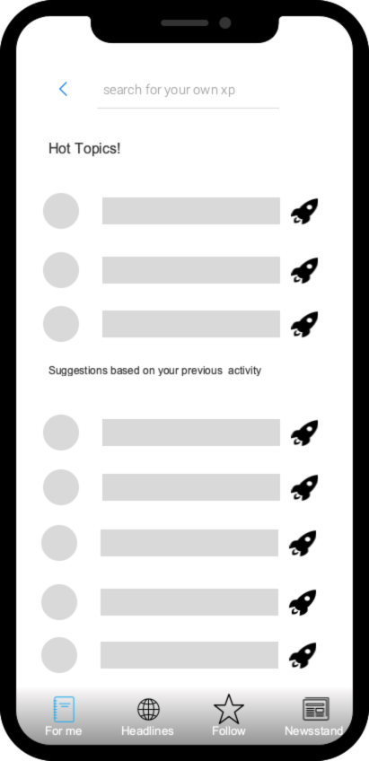
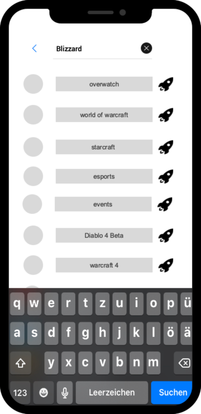
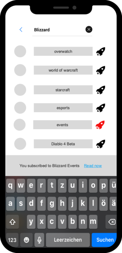
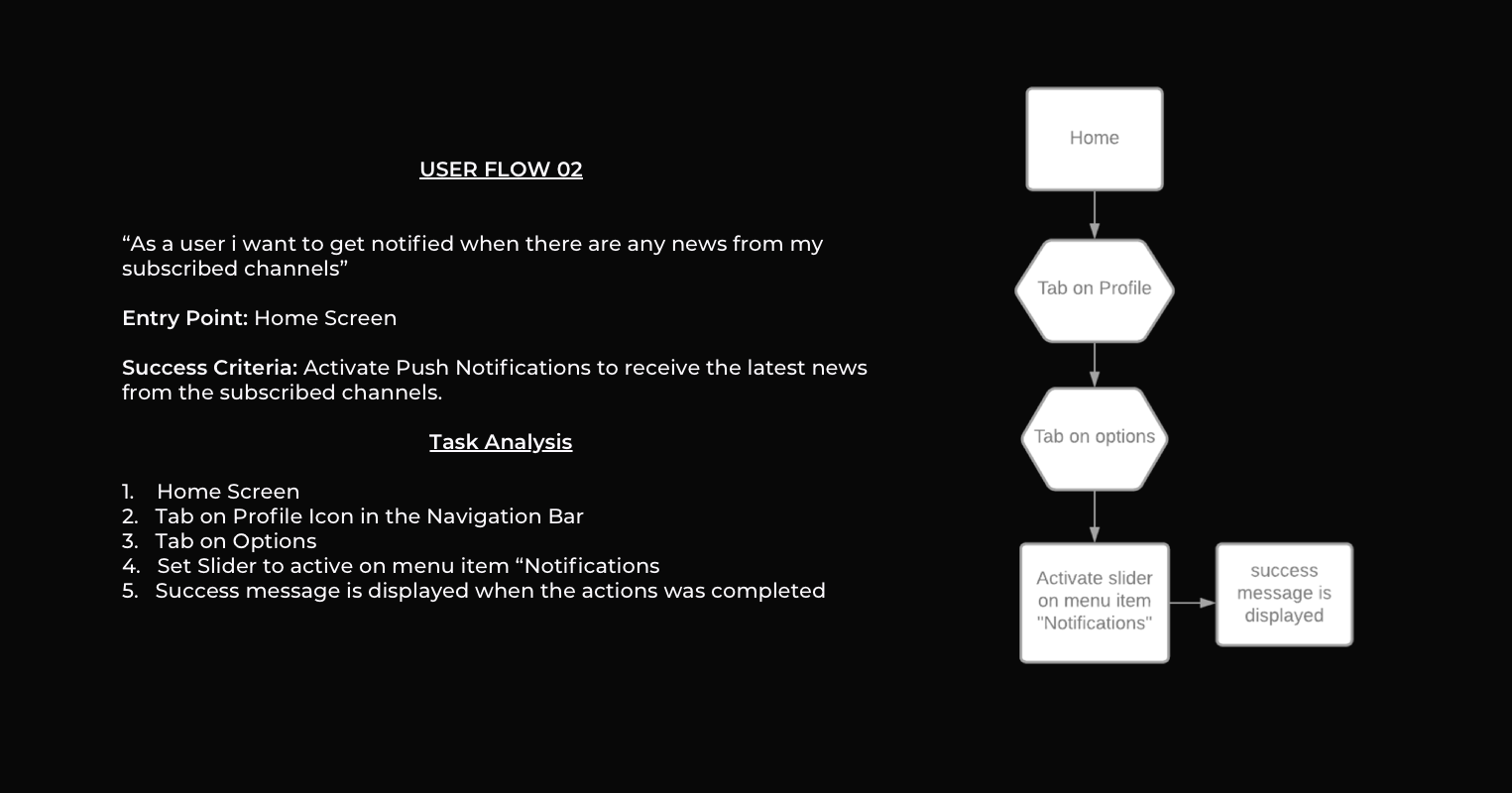
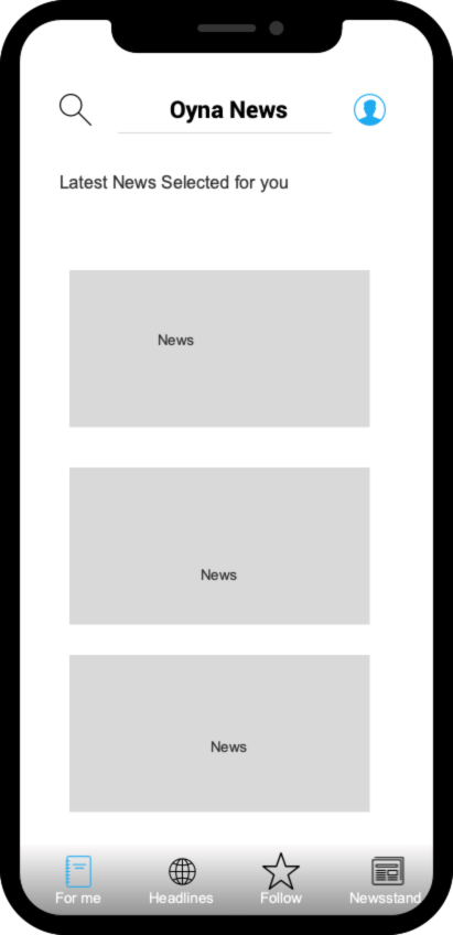
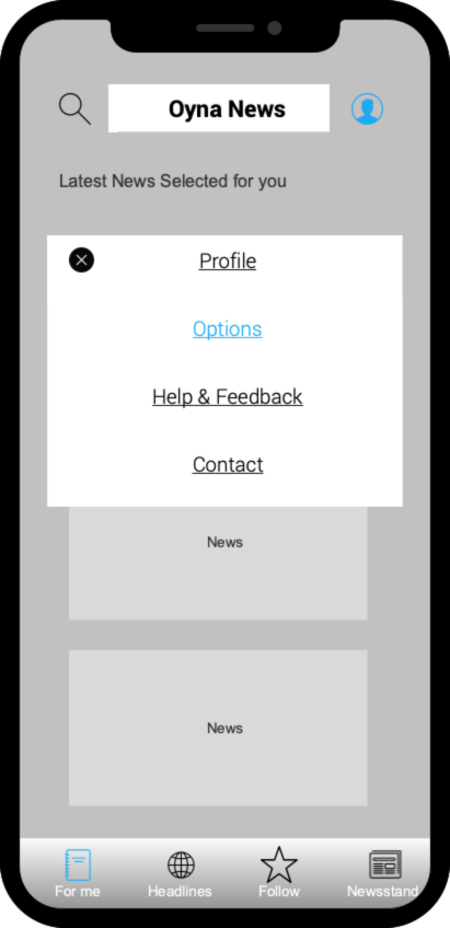
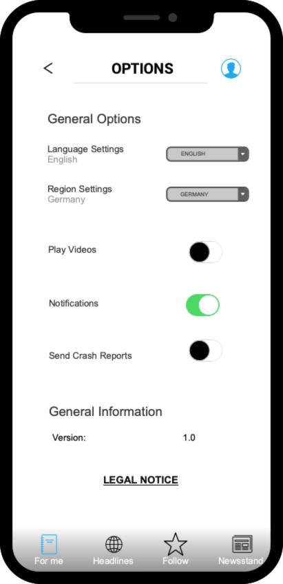
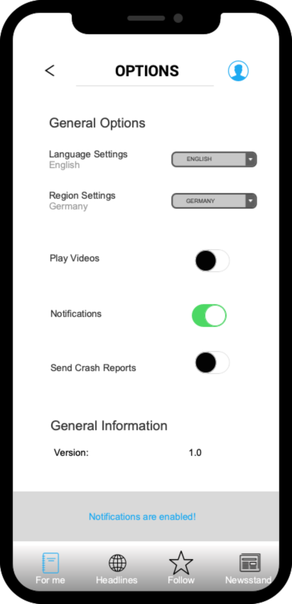
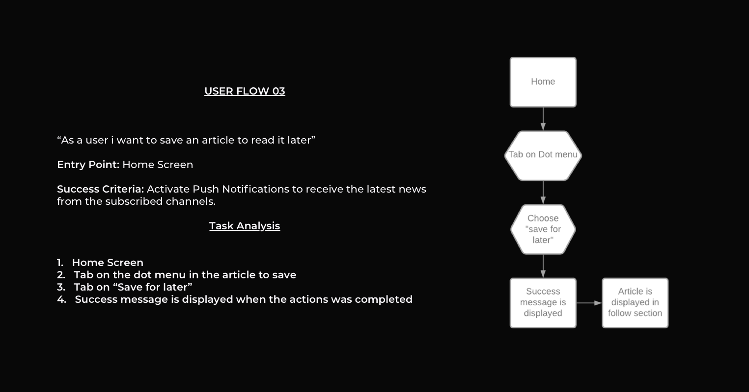
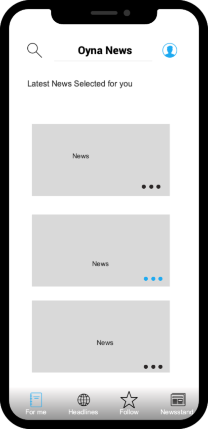
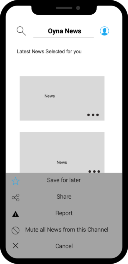
The next task was to design user flows to define the steps the user would take to reach their goals. This included to create user stories, user flows and a flow diagram. I also created some low-fidelitiy wirefames with Balsamiq to have some visual feedback.
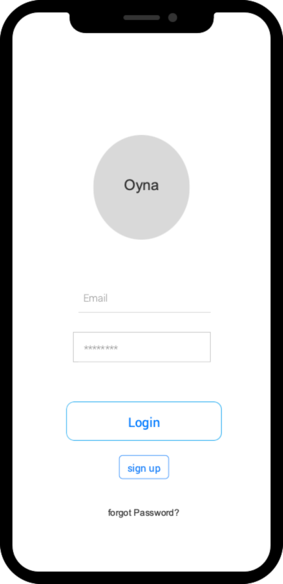
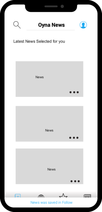
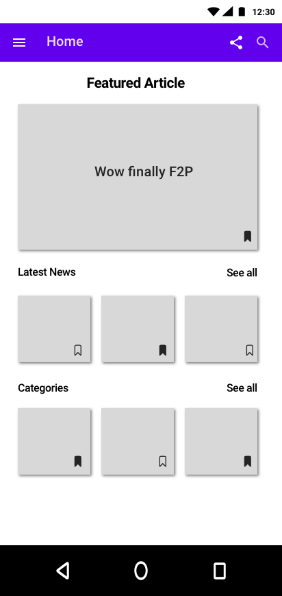
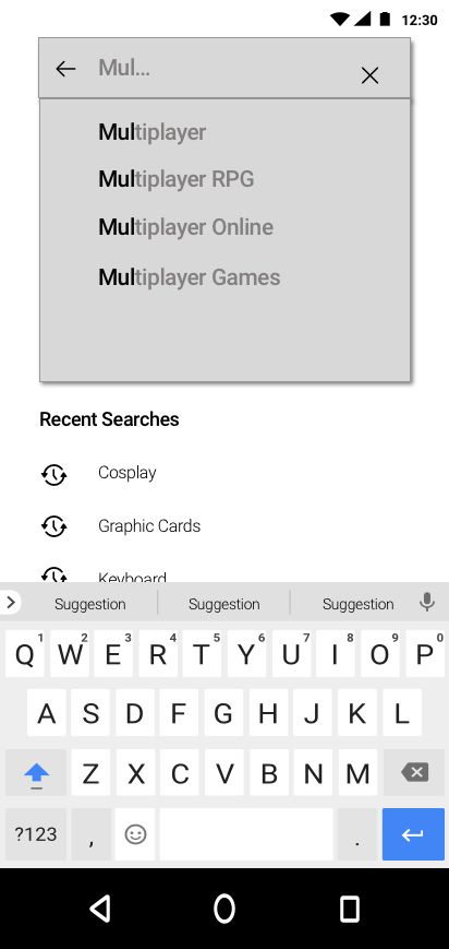
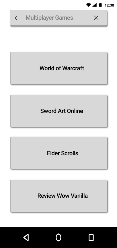
Android Mid Fideltiy Wireframes
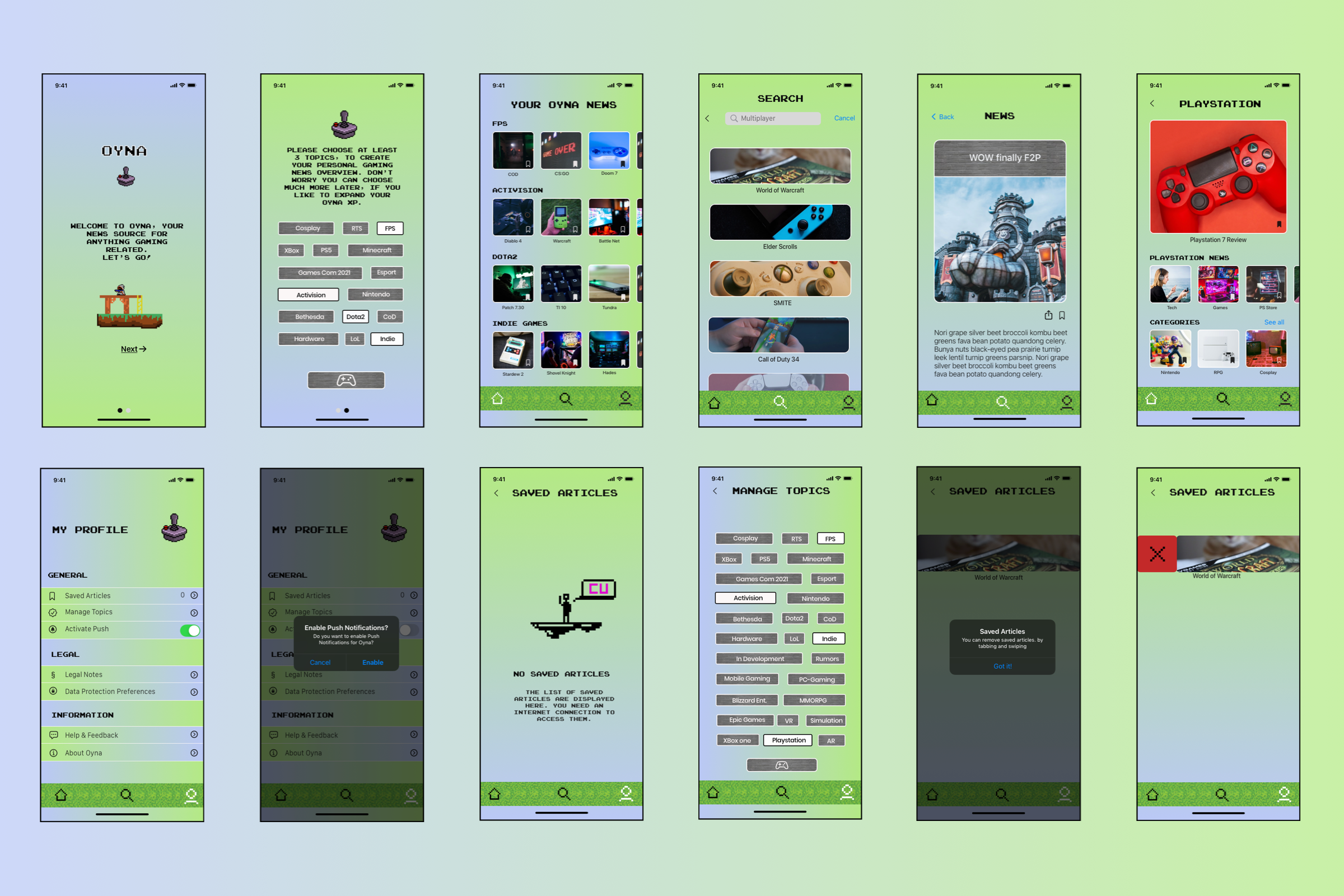
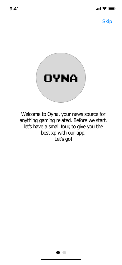
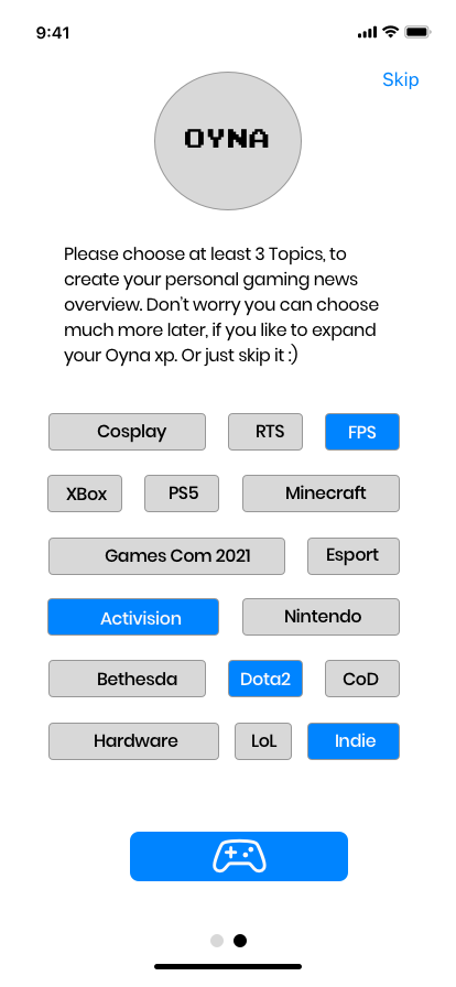
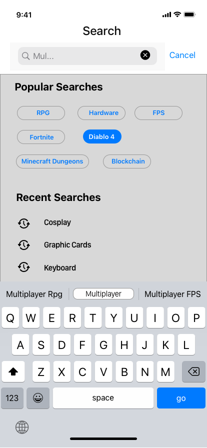
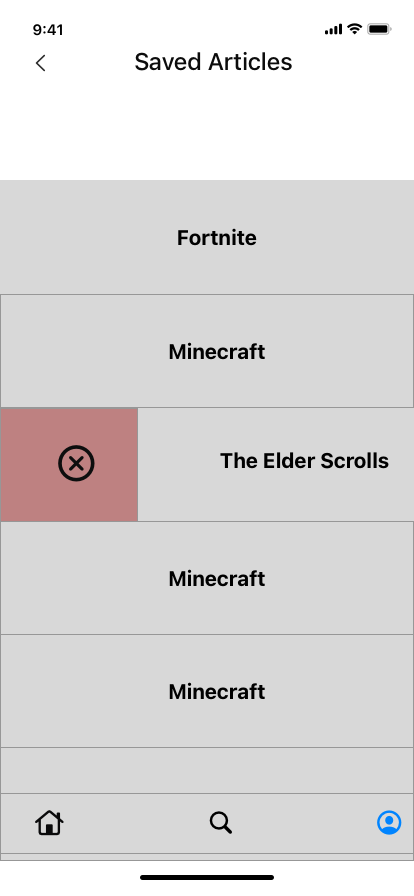
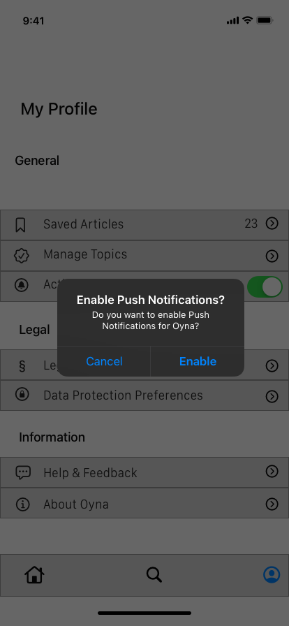
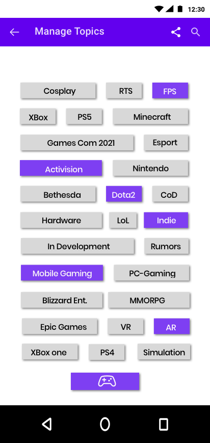
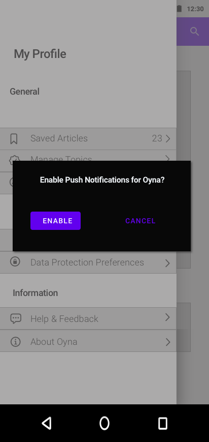
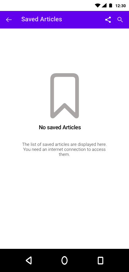
In the next step, i created mid-fidelity wireframes for Android and IOS. The 2 versions were developed according to the material design guidelines of android and the human interface guidelines of apple.
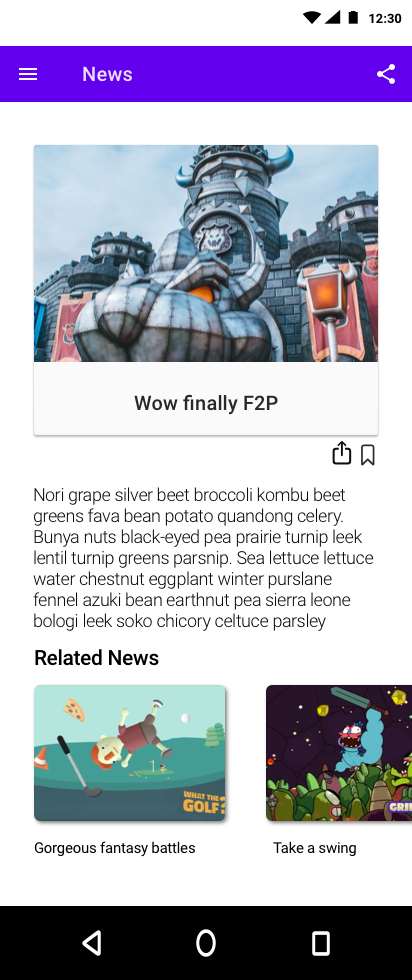
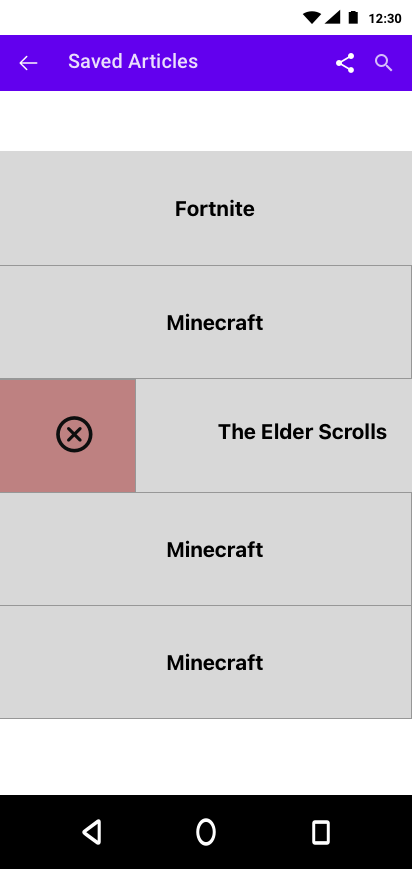
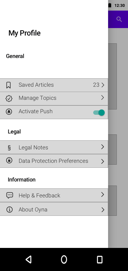
IOS Mid Fideltiy Wireframes
User Testing & Prototyping
The mid-fideltly wireframes then, served as a blueprint for hi-fidelty wirefames which i used to create to prototypes and uploaded them to invision for user testing. The prototype was tested by 8 people and I received feedback from 4 android users and 4 ios users. The feedback received, i then incorporated into the final designs
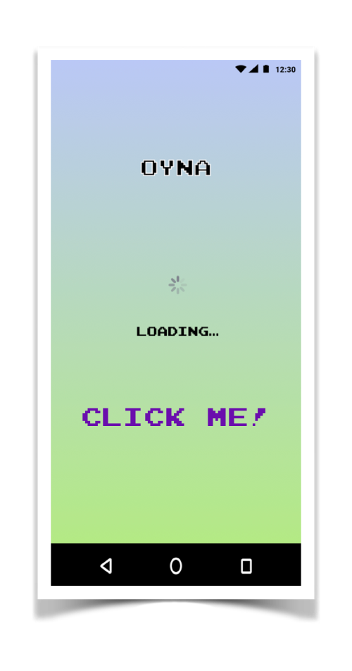
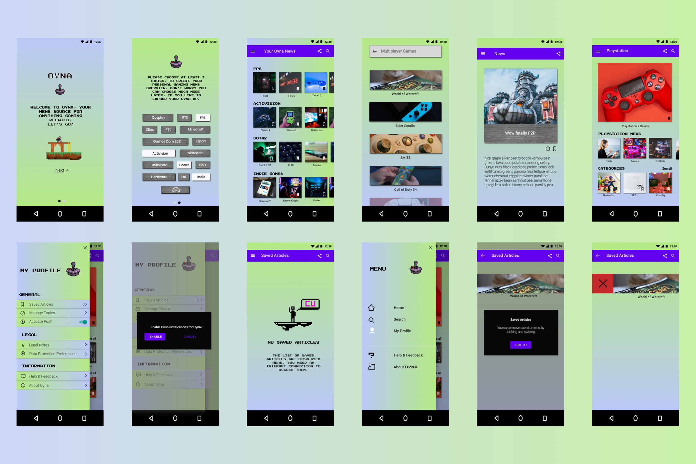
Final Design – Android & IOS
