
Kanto Roads
Your Cultural Companion
case study
Overview
For my second student project, the brief required us to design a mobile application, either a location-based recommendation app or recipe app. I chose to to a location based app, focussing on Art & Music.
Kanto Roads is an location based app for finding and sharing cultural events, concerts, museums, galleries, pop up shops and aynthing else that is related to art & music. Gallery Owners, Club Promoters, Concert Organizers can create a profile to inform about their offerings.
Requirements
The deliverables for this project were broken down into the following tasks:
1. Competitive Analysis 2. User Research & User Personas 3. MVP Document
4. User Stories and Flows. 5. Paper Prototyping 6. Usability Testing
7. Mood Boards 8. Preference Tests 9. Mock-Ups. 10. Style Guide
1. COMPETITIVE ANALYSIS
I analysed two existing location based apps, aiming for different kind of users: Foursquare and Roadtrippers. The analysis involved looking at the apps’ overall strategies, key objectives, target markets, marketing strategies, SWOT analysis, and UX analysis. Here are most of my findings.
KEY OBJECTIVES
Foursquare City Guide is a local search and discovery mobile app that helps users discover new places from a community of peers.The app provides personalised recommendations of places to go near a user’s current location based on the user’s previous visits, likes and check-in history.
Dennis Crowley and Naveen Selvadurai founded the company in late 2008 and launched it in 2009. Originally the user was able to check in into places/spots and earn badges. In 2014, Foursquare decided to ditch its original legacy app. Instead, the company announced, it would offer check-ins and ambient location-sharing via a new app called Swarm and the new and improved Foursquare would focus solely on place recommendations, essentially turning Foursquare into a direct competitor to Yelp.
Places by Foursquare is a database of more than 105 million places worldwide and an API that enables location data for Apple, Samsung, Microsoft, Tencent, Snapchat, Twitter, Uber, and others. As of October 2018, Foursquare claims more than 150,000 brands and developers have registered for the technology.
OVERALL STRATEGY
Being a social network for about 5 years, Foursquare decided to change their initial approach. They released swarm which is more or less an old Foursquare while transforming Foursquare to a place recommendations app, similar to yelp. Since they have approximately 3 (!) Billion visits/month around the globe That data came handy when it comes to advertisement , so they also released another app called pinpoint which is their enterprise product for companies. Half of the biggest companies are already customers.
Developer tools are also an integral part of Foursquare’s business. as they also released The Pilgrim SDK and Places API which are providing location tech to 125K+ developers.
MARKETING PROFILE
From the early days on marketing was always very important and initially made Foursquare become what they are today. They almost used everything expect print to advertise their services. Any social media channels one can think of, special promotions, & collaborations (e.g. History Channel, petfood, soft drink companies ), Influencers and celebrities.
In the long run this paid off and nowadays it is the opposite way around. Companies now use Foursquare and their other brands, applications and API’s to market their products. Some of the biggest companies in the business are using Foursquare: Apple, Samsung, Airbnb , Mircrosoft, Spotify and Uber , to name just a few.
KEY OBJECTIVES
Road Trippers is marketed as a personal (digital-)travel guide, relying on a huge database. The user can use their turn based navigation, pick a star-end point and decide how far off the route he wants to go., to turn the road trip into an adventure. This is also heavily advertised. The user can also choose from features to estimate the gas cost, book hotels and tours on the way, save cool places to visit later and get recommendation from other users which they call “Roadtrippers”
OVERALL STRATEGY
Roadtrippers mostly relies on their own brand and community. There is not much on the web, when it comes to press releases or marketing in general. They have a really well designed magazine on their website with new articles every 2-3 days., which includes tips and travel related articles. Additionally to the mag, they have a section called “Voices from the road” where people can share their own travel experiences.
MARKETING PROFILE
Roadtrippers is a web based software application that helps travellers plan road trips. The application road trip planner calculates approximate trip mileage, travel time, and fuel cost. The software lets users discover independently owned points of interest anywhere in the United States, within 50 miles of a planned trip. Once a trip is saved, it can be synced to the Roadtrippers iPhone app, for turn-by-turn navigation, and further local discovery while on the road. Since 2011, the team at Roadtrippers have worked on securing investments and growing the business. Co-founders, James Fisher and Tatiana Parent, founded Roadtrippers. The headquarters are in Cincinnati, Ohio.
SWOT ANALYSIS
FOURSQUARE
Strengths:
- very known brand throughout internet users
- very smart marketing strategy
- Huge Database and Userbase
in the early days very user driven which made Foursquare one of the biggest players when it comes to recommendations and exploring new places
- Free dev API’s
Weakness:
- Very commercial
- Unable to locate spots and venues “off the grid”
- very similar to yelp nowadys
Opportunities:
- implement old check in system more prominently to be more original against
Competitors:
Trip Advisor, Yelp, google maps
google maps
ROADTRIPPERS
Strengths:
- very known brand throughout internet users
- very smart marketing strategy
- Huge Database and Userbase
in the early days very user driven which made Foursquare one of the biggest players when it comes to recommendations and exploring new places
- Free dev API’s
Weakness:
- Very commercial
- Unable to locate spots and venues “off the grid”
- very similar to yelp nowadys
Opportunities:
- implement old check in system more prominently to be more original against
Competitors:
Trip Advisor, Yelp, google maps
google maps
2. USER RESEARCH
The next task involved conducting user research by interviewing at least three people which are relevant for the target market. We needed to create a questionnaire with 5-7 questions. From the results of the interviews i defined my target group/users and set the most reasonable features for my location based app.

Potential User Profile that I Identified
-
Anyone who is interested in art and music and does not want to browse websites, especially when travelling. Also people who owns or manages an artsy spot and wants to promote it in one tool.
- Age Group: 20+
- Location: Worldwide
How will my App help Users?
- Finding Interesting Spots and Events which are off the grid
- Users can spontaneously visit exhibitions and/or make plans with friends for a night out
- Frequent Travellers who want to discover new places when visiting a city for the first time
- Share reviews with other users, so they can get an idea of the locations
- Users who want to buy arty things
- Users can get updates about a specific event or location (price range, already sold out, cancelled etc.)
3. USER PERSONAS
After analysing the results of the questionary, i developed three user personas.


4. USER STORIES & FLOWS
I created a MVP document outlining the core aspects and functionalities for the app. Based on these findings, i developed user stories and user flows.


5. PAPER PROTOTYPING
With the sketching method crazy 8, i sketched paper prototypes based on the user stories i created earlier.

6. USABILITY TESTING
I created a digital prototype of the paper versions of the App with InVision. These were then provided to the test users. We defined a goal and objective for the test. My testers were given three task, that they had to try to complete with only the minimal amount of help from my side.

7. MOOD BOARD
I created a mood board to reflect the style of the app design i was aiming for. It is a collection of colors, images, fonts and textures that perfectly defines what the project is about visually.

8. PREFERENCE TEST
I conducted a preference test via usabilityhub. I uploaded a variation of the filter screen from my app. The feedback of the participants has helped me to find out which design the users will prefer.

OPTION A: 26%
“Better to read, i also like the purple and black
“Both are good in their own way, but i prefer the darker one, since it is better to read”
“Dark one is better to read, but i would use icons instead of pictures”
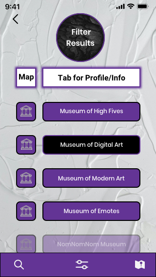
OPTION B: 74%
“I chose this grey background one bc the subtle background sets it apart from the ordinary/expected. also the icons are a bit more clean/clear to view than the tiny photos”
“Friendly design”
“Looks more clean and sympathic”
9. MOCK UPS & RESPONSIVE DESIGN

")


10. STYLE GUIDE
The style guide i created, is a document that provides guidelines for the way my brand is presented from both a graphic and language perspective.


contact@ucmein3d.com